Variable-Data Pie-Chart from Line-Art in Adobe Illustrator with Darty-Ai
Welcome to another Darty-AI Illustrator variable art tutorial. Today we are going to focus on a common data visualization task: creating a basic pie chart out of nothing but a circle, appearance strokes, and some mathematics featuring Pi.
Although Darty-AI does not support native Illustrator variable graphs at this time, for many data visualization use cases the freedom it offers for line-art manipulation is more than sufficient.
Design Phase
This is where the magic happens.
Step 1: Draw the Circle
- Width: 100 px
- Height: 100 px
Now here’s the key detail:
Set the stroke width to 100 px.
This causes the stroke to expand inward and visually fill the circle, creating the appearance of a solid disk. The fill is irrelevant — the stroke is doing the heavy lifting.
At this point, you’re not looking at a stroked outline anymore. You’re looking at a stroke-based “donut” that fully overlaps itself.
Step 2: Understanding the Circumference Trick
The circumference of a circle is:C = πD
Since our diameter is 100 px, the circumference becomes:100×π≈314.159100 × π ≈ 314.159100×π≈314.159
Here’s the discovery:
If you divide the correct dash length by the circle’s width (100), you get… π.

That means:
Dash length = Width × π
So instead of manually tweaking the dash array for 20 minutes the ‘eyeball way’, you can calculate it instantly.
Step 3: The Dash Array Setup

Open the Stroke panel and enable:
Dashed Line
Now set:
- Dash: 314.159
- Gap: 314.159
Because Illustrator does not allow negative dash offsets (unlike After Effects), the trick is to make the dash and gap equal.
Next, you can add a Transform effect to scale up this circle to fit your document.
What to Watch Out For
Due to the decimals, when scaling up the artwork using the Transform effect, there can be a small gap visible as a hairline slice. To fix this, simply add a 1-pt buffer to the dash values to end up at 315.5.
- The stroke must equal the diameter.
- Have ‘Scale Strokes & Effects’ ON to scale proportionally. If you change the circle size, it should then automatically recalculate.
- Illustrator has a dash and gap limit of 1000 points, but this isn’t a problem when we use a transform effect to enlarge the entire item later.
If your circle is 250 px wide?Dash = 250 × π ≈ 785.398
Same rule, always.
Phase 2 – Turning It Into a Pie Slice
The easiest and most intuitive way to control the artwork of individual pie slices is to think of it as a normal bar-graph with all bars overlaid on top of one another, bent into a shape of a circle.

Adding several appearance strokes with the same dash values sets up the amount of potential slices. These strokes could also be added dynamically via Darty-Ai; likewise a set of paths can be made to work just the same as multiple appearance strokes.

This way, we only need to use a data trick to cumulatively track the pie-slice values in order to always fill the slice from the ‘bottom up’ along the curve. The exposed part of each slice appearance stroke appears like a small slice because of the slice-strokes above.
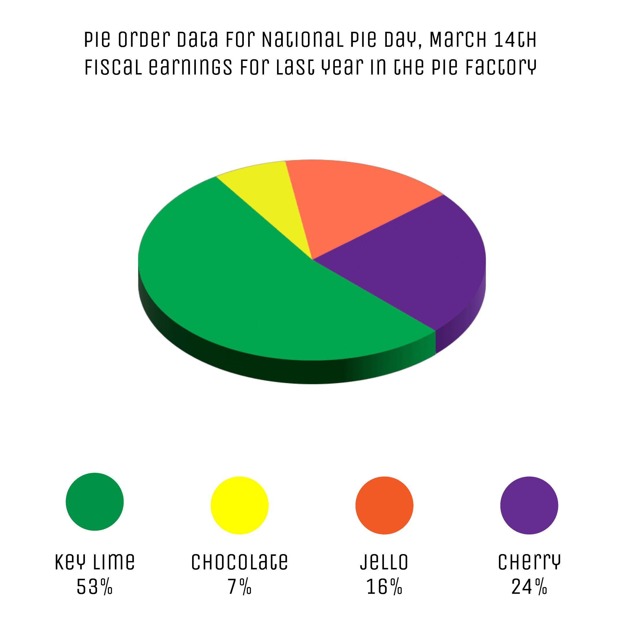
| A | B | C | D | E | F | G | H |
|---|---|---|---|---|---|---|---|
| * | chart-circ | * | chart-circ | * | chart-circ | * | chart-circ |
| comment | appearance | comment | appearance | comment | appearance | comment | appearance |
| * | stroke[1]dashValues | * | stroke[2]dashValues | * | stroke[3]dashValues | * | stroke[4]dashValues |
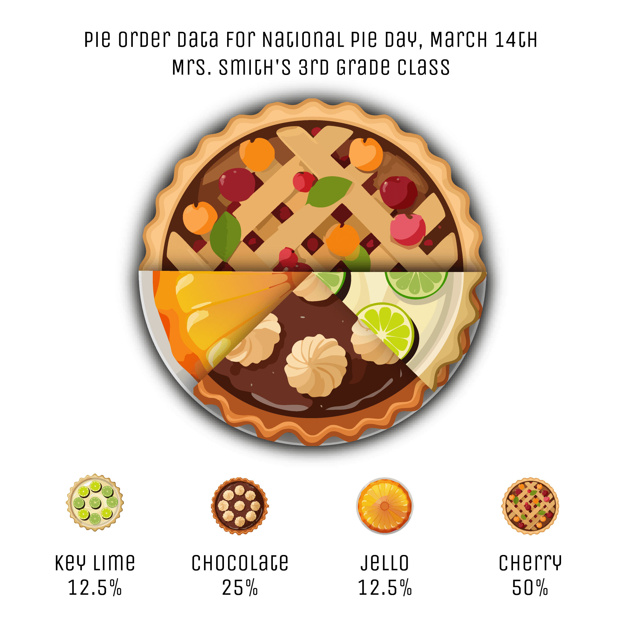
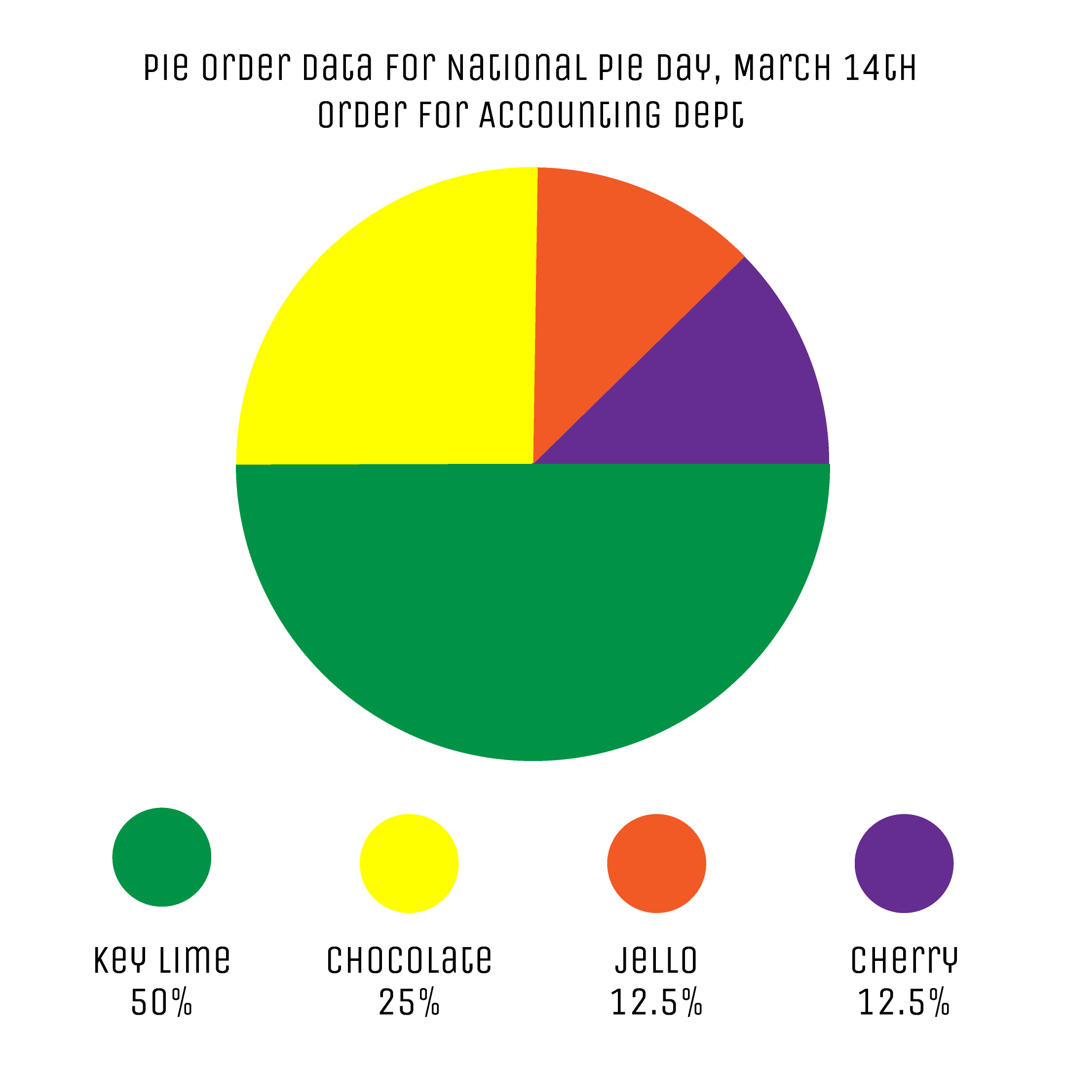
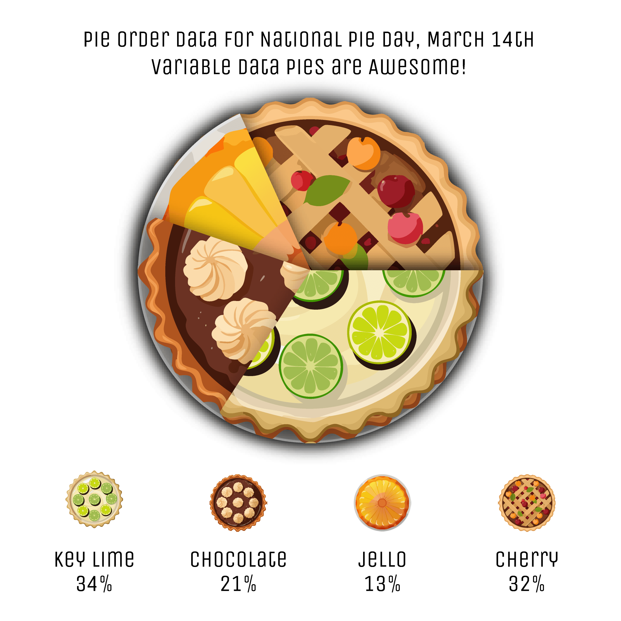
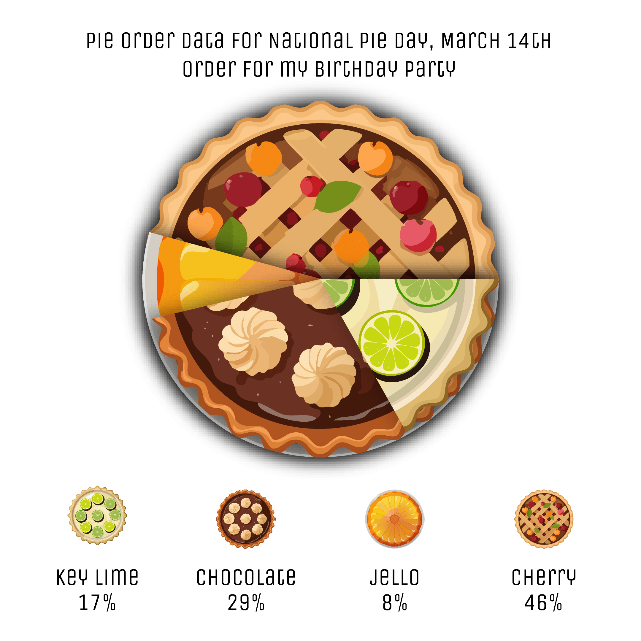
| slice-1 | slice-2 | slice-3 | slice-4 | ||||
| 50 | 157, 315.5 | 25 | 236.5, 315.5 | 12.5 | 275.5, 315.5 | 12.5 | 314.5, 315.5 |
| 12.5 | 39, 315.5 | 25 | 118.5, 315.5 | 12.5 | 157.5, 315.5 | 50 | 314.5, 315.5 |
Each ‘human-readable’ percentage value is in a comment column preceding the real value column. In the value column, a formula multiplies the number in the cell to the left by PI. It also concatenates the value of the ‘gap’.
Because this is the most minimal cumulative approach, the value formulas of next column groupings accumulate the values of preceding columns via SUM().
- Use transform effect to rotate non-cumulative stroke-slices into place.
- Use separate artwork and rotate/stack them with the possibility of having their own added fills and strokes.
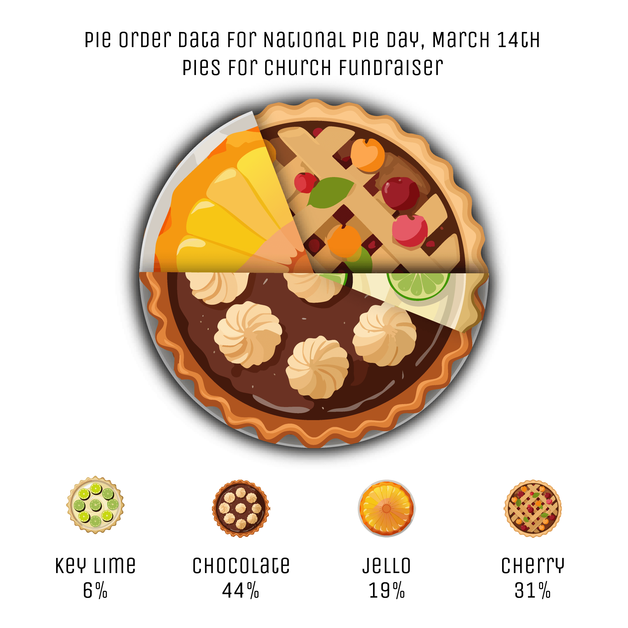
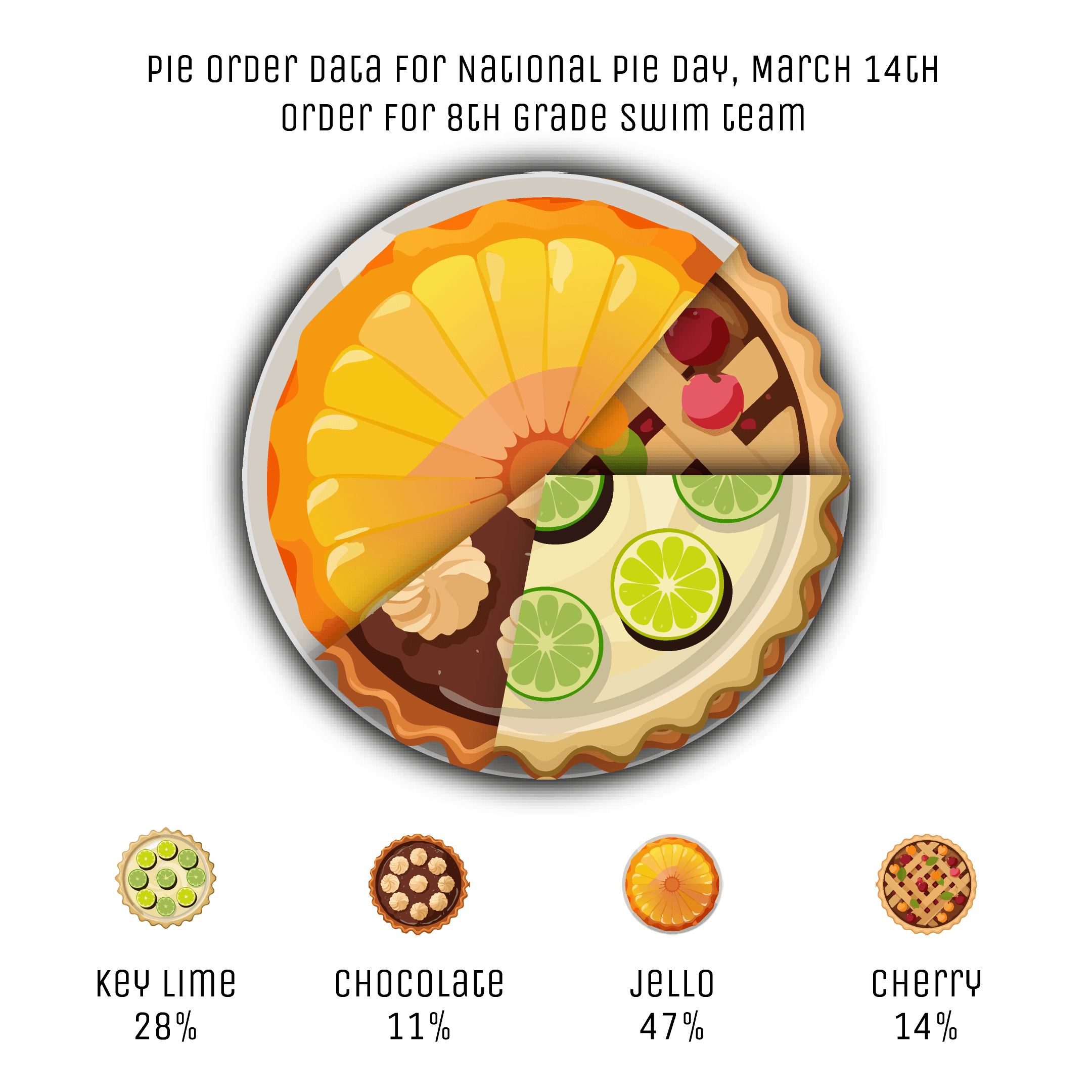
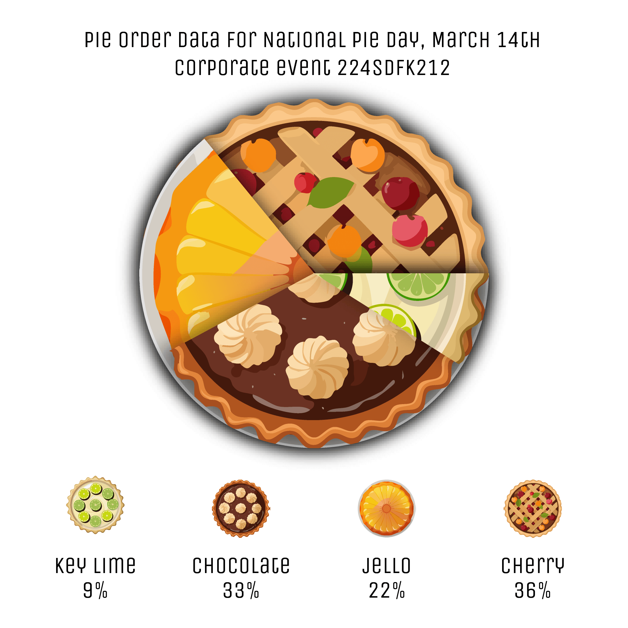
Styling the Chart
One of the all-time drawbacks of Illustrator's native Pie Charts is the lack of control when styling charts rendered with variable data as those elements always snap back into their initial state when every record changes. If you wanted to style some slice in a different way, the variable-data replacement seemed to consistently wipe away those properties.
Not anymore!
With Darty-Ai, it is possible to affect the artwork in multiple ways: from setting a color to applying 3D effects and even using patterns to display graphics inside of pie-slices.
While this example uses cumulative-value dashed strokes on only one path art-object, even this type of artwork can be styled powerfully — and if separate objects are used, then the potential is virtually limitless.